overview
The BKPS Platform, a complete suite of tax solutions offered by Bookeepers, used to look archaic and awkward, causing a substantial number of support requests and a loss of customers over time. My task was to completely revamp the platform, providing a rejuvenated interface and new features for existing and new users alike.
Role
UI Design
Research
Prototyping
Usability testing
duration
February - April 2020
Context
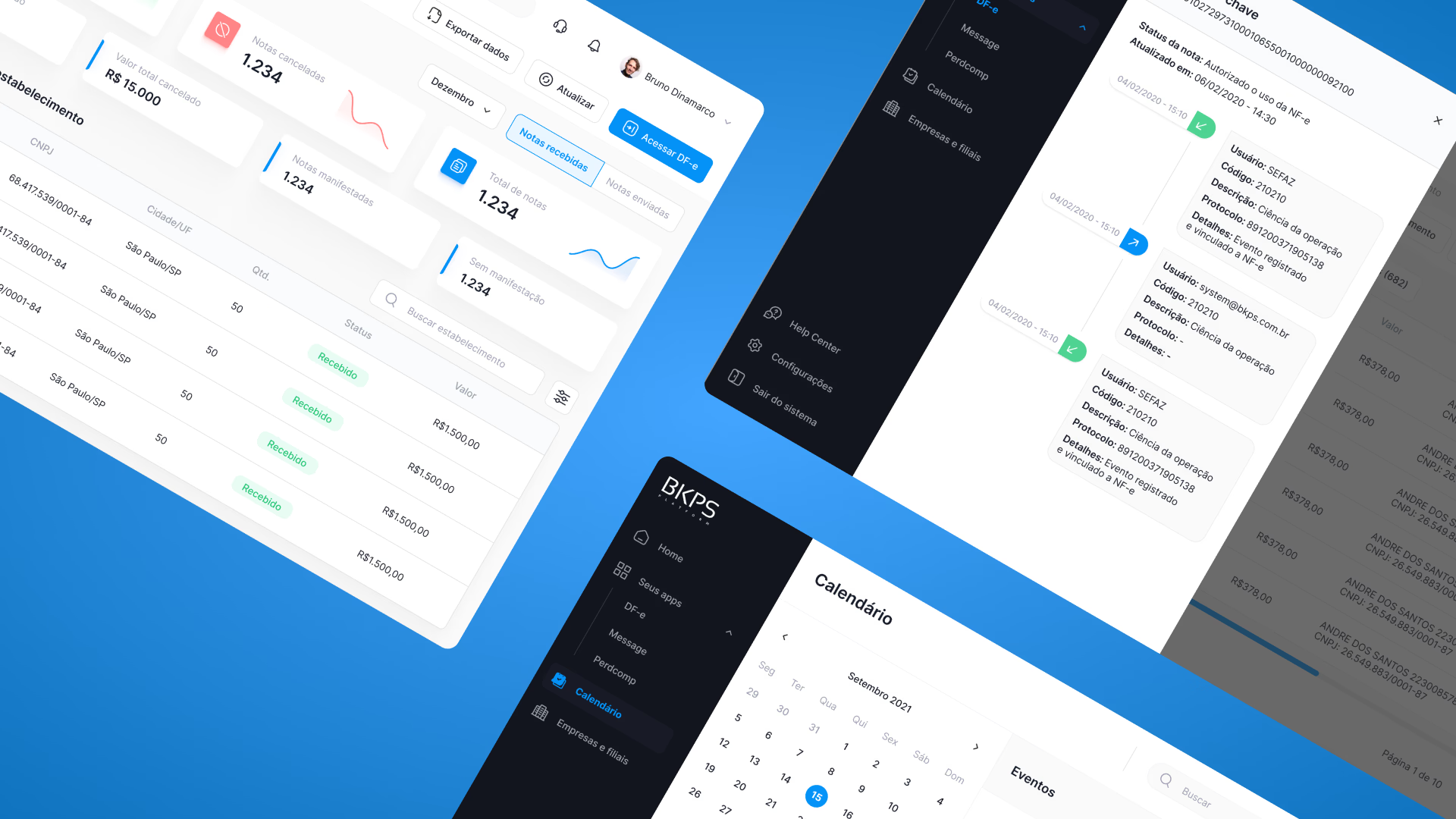
Currently, the platform features three modules. The main one, DFe, serves as a dashboard centralising different tax documents. This module ensures easy extraction of reports, execution of tax manifestations, viewing of notes collectively and individually and enables their download too.
The Message module acts as a bot scanning messages from tax bodies directed to the taxpayer across various mailboxes, focusing them all in a single location.
The Perdcomp module handles the download and updates of all logged compensation demands, leading to significant time-saving for every user than if they had to access each individually.
The problem
The system fell short on multiple usability principles, leading to numerous tech support inquiries and causing an immense backlog. Several business regulations got overlooked due to the product's inadequate usability. Consequently, we needed to overhaul the platform, update its interface, the overall user experience, and consider introducing features that could enhance the user workflow. However, we faced a tight timeline for the project, which necessitated a lot of improvisation throughout the journey to utilize available time efficiently.
Issues investigation
To start the understanding process, I first conducted interviews with a pair of tech support personnel to comprehend the most widespread challenges experienced by users. Some of the most common support calls revolved around the difficulty of uploading digital certificates, recovering accidentally deleted information, difficulties in understanding the flow of registering companies and branches, and issues related to the platform's performance, such as slowness and timeout problems.
Following this, I had discussions with five distinct customers from multiple companies to deepen my comprehension of their product interaction, their frustrations, their satisfactions, and new feeature suggestions. The main gripes aired by the customers included: excessive steps to finish multiple journeys that could be a single task, an exceptionally bewildering sign-up system (leading to immediate support calls), perplexing listings, sluggish system performance, system inconsistencies, concealed features, the shortage of concise information, file upload limit amongst several other criticisms.
In conclusion, I undertook a deep exploration of the product, pinpointing all usability drawbacks following Nielsen's 10 rules of usability, where I could actually feel the problems experienced by users, since many of the pains reported by them were directly affected by poor usability.
Research findings and hypothesis validation
Equipped with user-sourced data and completed heuristic review, I conducted a comparative study of key competitors to ascertain how they have integrated features akin to our platform, while seeking to comprehend novel function demands from users. My analysis encompassed Arquivei, Oobj, and NFe.io as I endeavored to identify what unique aspects they possess that BKPS lacks. Ultimately, armed with this wealth of data, I engaged in a card sorting session with stakeholders, culminating in the creation of a sitemap, laying the groundwork for a platform redesign.

User Interface solution
The updated iteration of the BKPS Platform introduces numerous enhancements aiding users to boost efficiency in their daily tax routine, alongside a fresh, contemporary appearance and numerous personalisation options.
Moreover, the entire registration flow has been restructured, guaranteeing users can commence utilisation of the platform swiftly, requiring minimal support.


Old interface
The prior layout overlooked fundamental design elements such as uniform visuals, transparent details and status, featured a strange page structure, and a comprehensive finish. Moreover, it failed to incorporate numerous features that were desired by users.


🔎 explore my work